
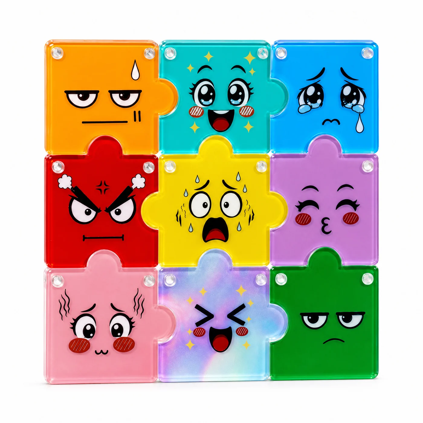
A child draws at the size the drawing deserves. A hand, an eye, a sweat drop that is four millimetres across on paper, because that is how it reads on paper. The part it has to live on is a pocket-sized acrylic square, and the same eye now has to survive a print head, a laminate of white ink, a cut line and a polish.
Most of the work in this set happened at that boundary: not changing the drawing, but finding out which parts of it were already at their minimum size before anything was cut.
A small detail is not a small problem
The nine expressions rely on small marks: a single tear, a pair of blush dashes, three steam puffs above an angry eyebrow. Printed at full artwork size on paper, they hold. Printed on a part a buyer keeps in a bag, they are the first thing to disappear, because the ink has spread by a fraction of a millimetre and the gap between two marks is what tells the eye it is a tear rather than a dot.
The fix is not to redraw the face. It is to give each mark a slightly heavier minimum stroke, then check the result at the actual viewing distance, which for a keychain is roughly arm's length from a shop counter, not close up on a desk.
Transparent acrylic changes the colour before the print does
Print colour straight onto a clear acrylic piece and the yellow turns olive. The ink has nothing behind it to bounce light back, so a colour that looked correct on a screen reads thin and grey on the part. Every face here therefore sits on a white ink layer that goes down first, with the colour on top of it.
That base is a decision per face, not one setting for the sheet. Too little white and the orange piece reads peach. Too much and the acrylic stops behaving like acrylic, because what the buyer sees is paint under a clear lid rather than a coloured translucent body that still passes light at the edge.
The gradient face is the difficult one. A galaxy printed over a thin white base turns muddy through the mid tones, so it takes a heavier base than the flat-colour faces standing next to it in the same grid.
Nine pieces means nine products
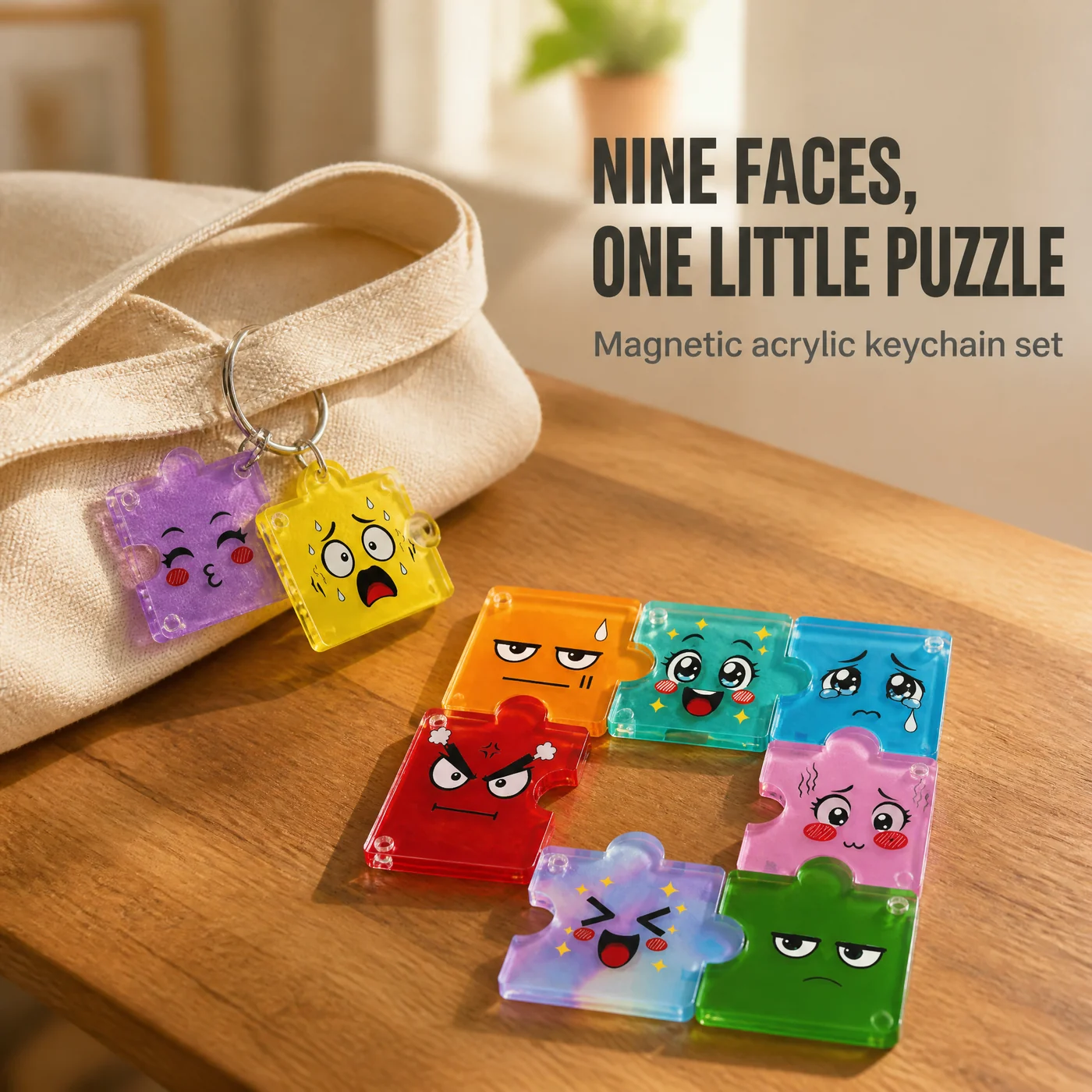
The set is sold as a blind box, so a buyer can receive one piece and nothing else. That rule shapes the artwork more than the magnet does: each face has to read as a finished object, not as a fragment waiting for eight neighbours.
It also means the hanging hole cannot be an afterthought. On a single piece the hole, the printed face and the jigsaw curve all compete for the same few millimetres of margin.
What we kept, and what we changed
Kept: the nine faces, the order they sit in, and the matching body colour for each one. Those were the designer's decisions and they survived to production.
Changed: the minimum stroke width on small marks, the white base weight per face, and the magnet orientation, which is now fixed at the assembly fixture rather than decided by hand. A magnet pressed in the wrong way round turns a neighbour into a pusher, and the piece will not seat no matter how the buyer wiggles it. That problem is written up in more detail in our earlier note on building the nine-piece blind box.
The edge is where the hand time goes
A sawn acrylic edge is opaque and grey, and on a clear part that edge is the first thing a buyer notices. Every piece is polished after cutting and then checked against daylight for haze. Polishing has a stopping point: push the heat too far and the surface crazes into fine cracks that only appear days later, after the part is already boxed.
What this set will not do
It is not a toy for small children. The magnets are small parts and they belong in a mouth exactly once.
It is not dishwasher safe and it is not meant to be scrubbed. Warm water and a soft cloth. Solvent cleaners attack the print before they attack the acrylic.
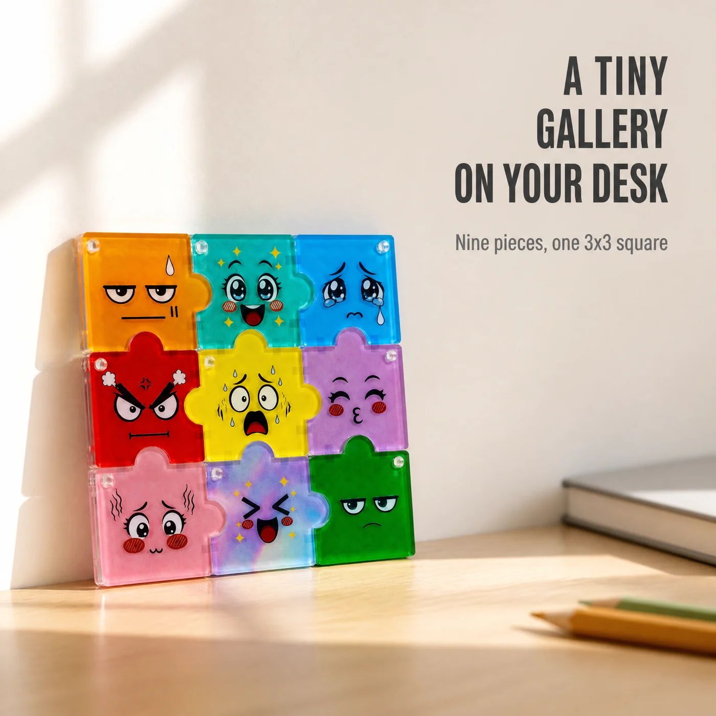
It will not carry a heavy bag. It is a charm and a small desk object, not load-bearing hardware. And the print is not light-proof: a set left facing a south window for a year will fade differently from one kept in a drawer. We would rather write that here than have a buyer find it in month fourteen.
Where the money goes
The designer asked that sales revenue from this set go to people who need it. That is the arrangement we are running on, and we are not going to decorate it with a percentage or a partner name we cannot evidence. When there is a verifiable number to publish, it gets published on this page.
How to start a set like this
Send the drawings, not a specification. Nine squares, any medium, photographed flat under even light. What we return is a print plan: which faces need a heavier white base, which marks will close up below a usable size, and whether the artwork survives being cut into a jigsaw at all. Some drawings do not, and it is cheaper to say so at the sketch stage than after a print run.
- Nine pieces, one face each, in the order you want them to assemble
- Front artwork per piece, plus one assembled reverse file if the back carries a continuous image
- The intended arrangement and piece orientation
- Key-ring or clasp preference
- Blind-box artwork, warning text and target market language
- Whether the set ships as one box or as nine single boxes
If the set is for a brand rather than a person, the same file becomes an OEM or ODM brief: your palette, your faces, your carton. Send it through the project enquiry form, or look at how we organize pins, cards and acrylic merch in one system on the MERCH-GRID page.